

Nutriventia
Core Brand Assets
Brand Strategy
Brand Guidelines
Brand Communication
Visual Extensions
Website UI/UX
Nature, science and you
Health is wealth - this old adage is slowly becoming a reality with consumers globally gravitating towards more holistic medical choices. With emphasis on prevention rather than cure, the good people at Inventia ventured into the nutraceuticals market. They reached out to us to create a new brand which talked in equal parts nature as much as science.
The positioning formula
Our workshops with the client lead us to the brand's key motivation - actively seeking for customer pain points and creating products that cater to those needs. This marriage of nature, science and customer needs allowed us to carve out the brand’s core thought - Nature, Science and You.
Not only did we keep the customer at the center of their positioning, we also brought them into the name. The ‘U’ in Nutriventia is symbolic of ‘you’ as the customer.


Vibrant and organic
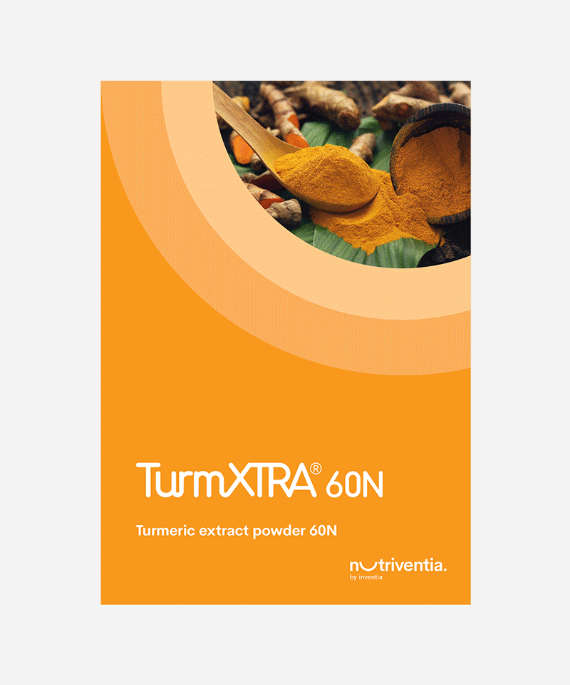
Linking back to equal parts nature & science, we wanted the brand to be vibrant and multicoloured. The 4 colours of Nutriventia represent nature, science, customer and the Inventia brand.
The illustration language is inspired by symmetry which allows the visuals to be unique without losing the seriousness of its subject matter.
Our layouts and iconography allow for clear and crisp communication with splashes of colour that make communication pieces stand out.