3 Big Things
Core Brand Assets
Brand Identity
Brand Strategy
Brand Communication
Visual Expansion
Website UI/UX
Brand identity for a behaviour design studio
3 Big Things is a behaviour design studio in India that believes every business problem is, at its core, a human problem. Using cultural and human context, they help leaders reframe and solve complex challenges.
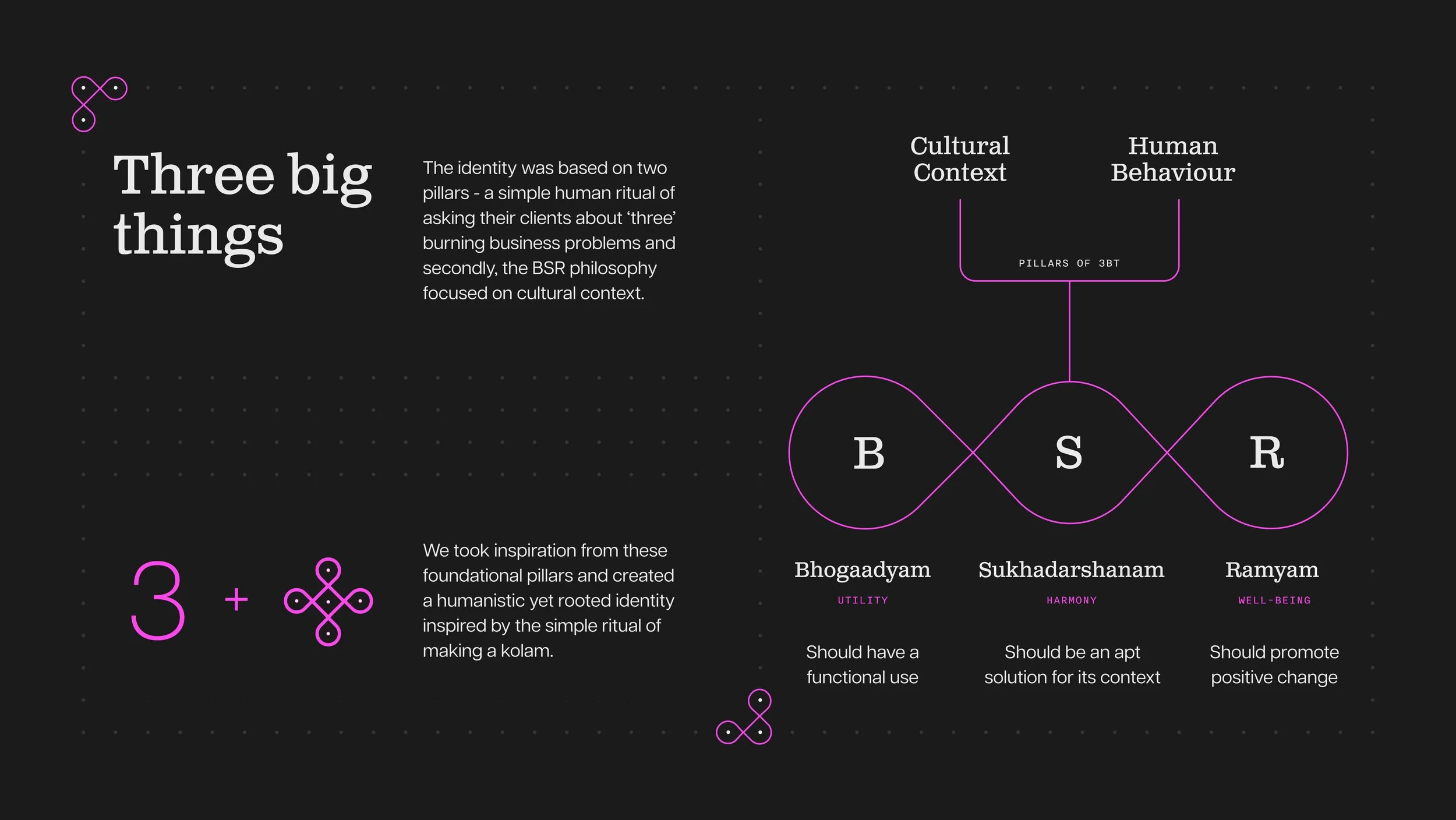
The identity draws from the kolam, a centuries-old practice governed by a simple rule: continuous lines with closed loops drawn around a dot grid. With this in mind, we built the form of 3 on a 3x5 kolam grid. Like human behaviour, kolam patterns are one and many things intertwined, reflecting the complex, interconnected existence of people and the cultural contexts that shape them.
An identity inspired by Kolam
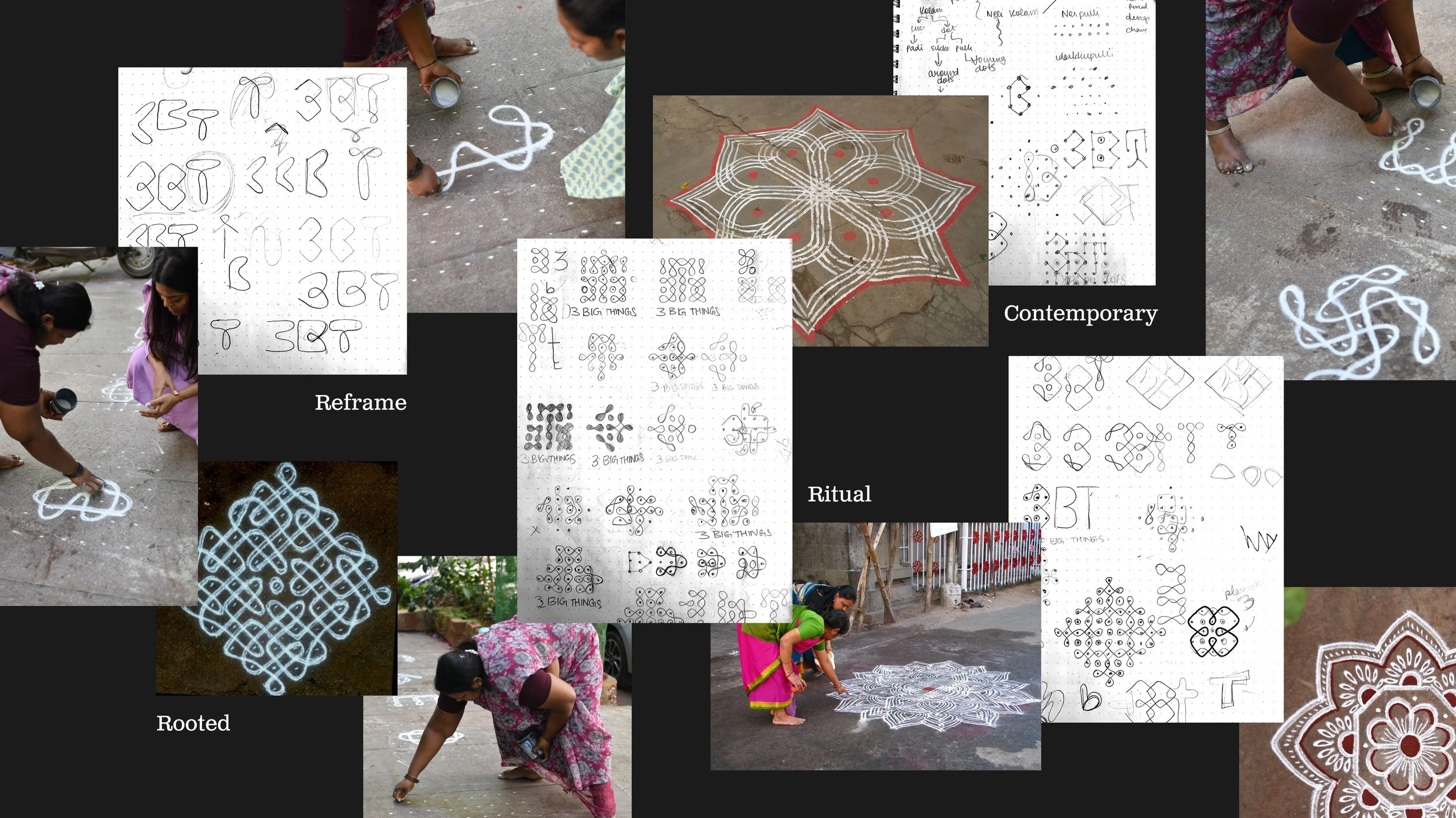
3BT needed an identity that could carry their core belief, that behind every business problem is a human problem, without becoming abstract or academic. Since cultural context varies, we grounded the identity in the kolam, a ritual drawing practice from Tamil culture, performed daily by women on the thresholds of homes, temples, and workplaces.
With the help of local women, we constructed various forms of 3’s in kolam grids and landed on an interpretation that captured 3BT's methodology: structured, yet deeply human.
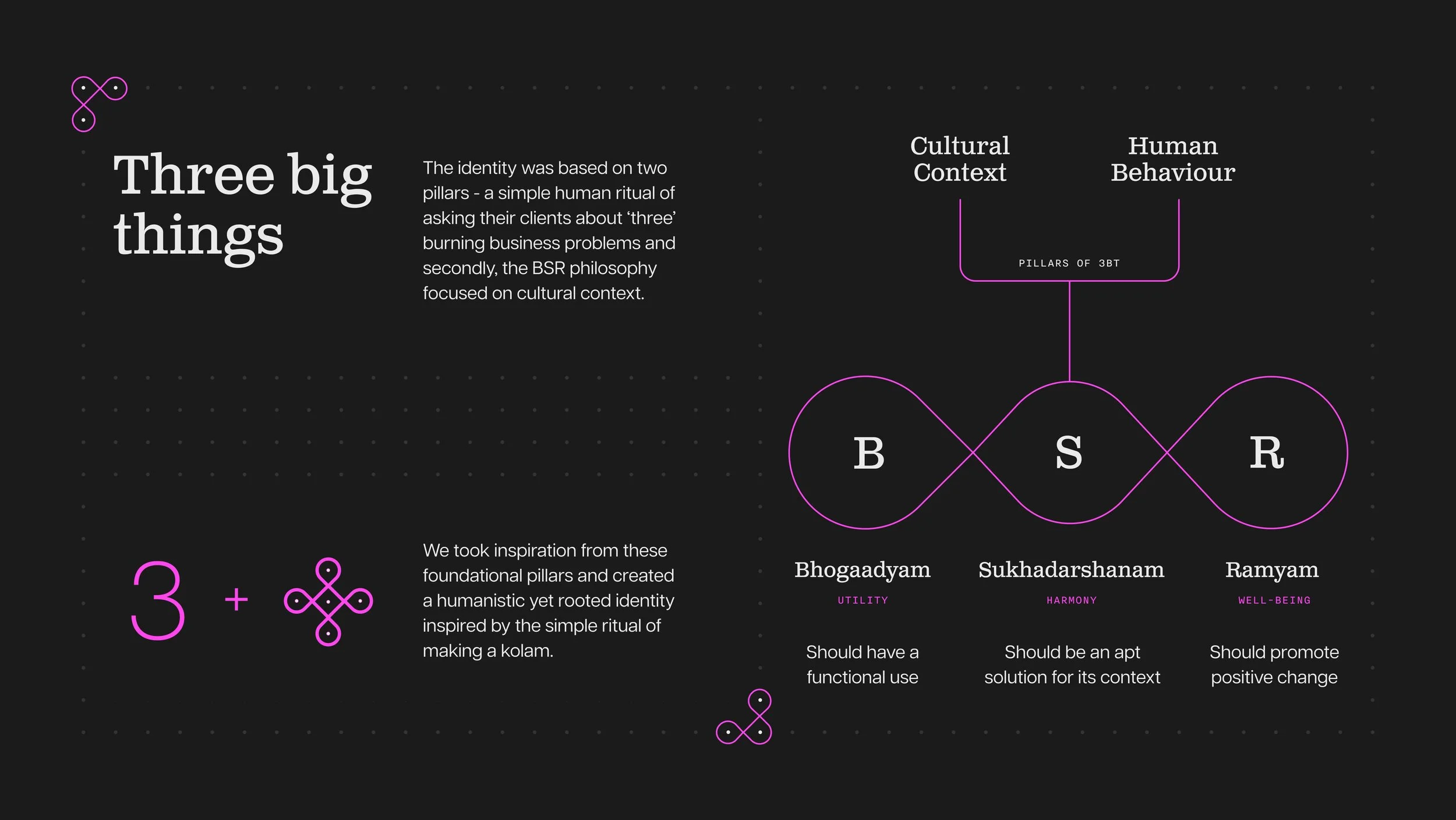
An identity inspired by Kolam
A bold, engineered visual language
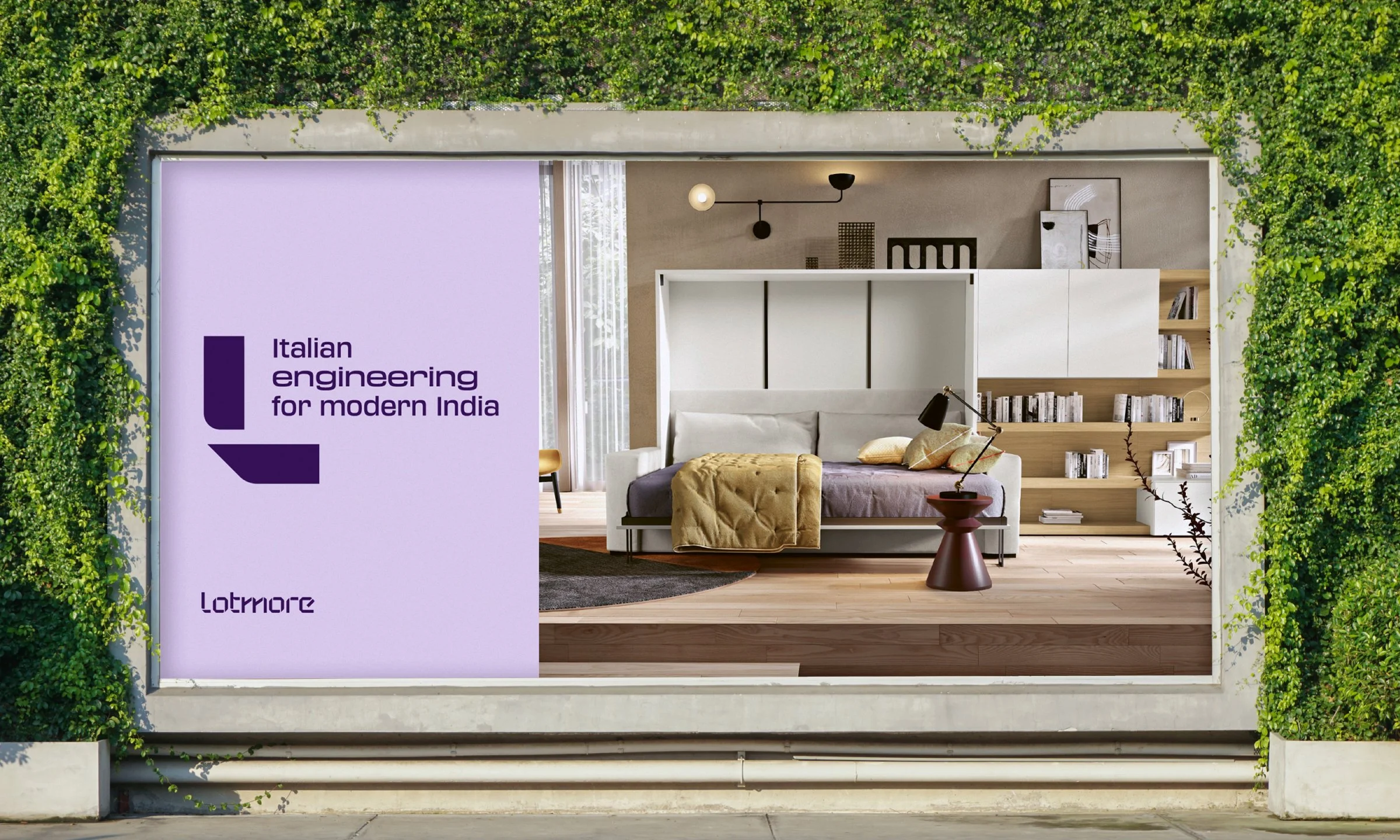
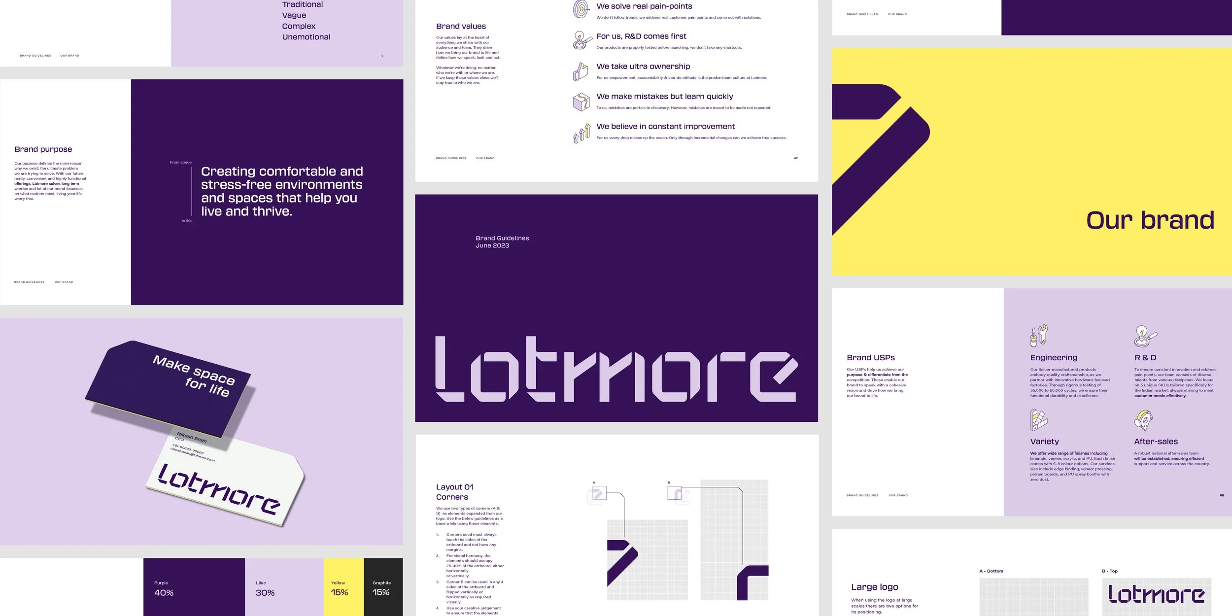
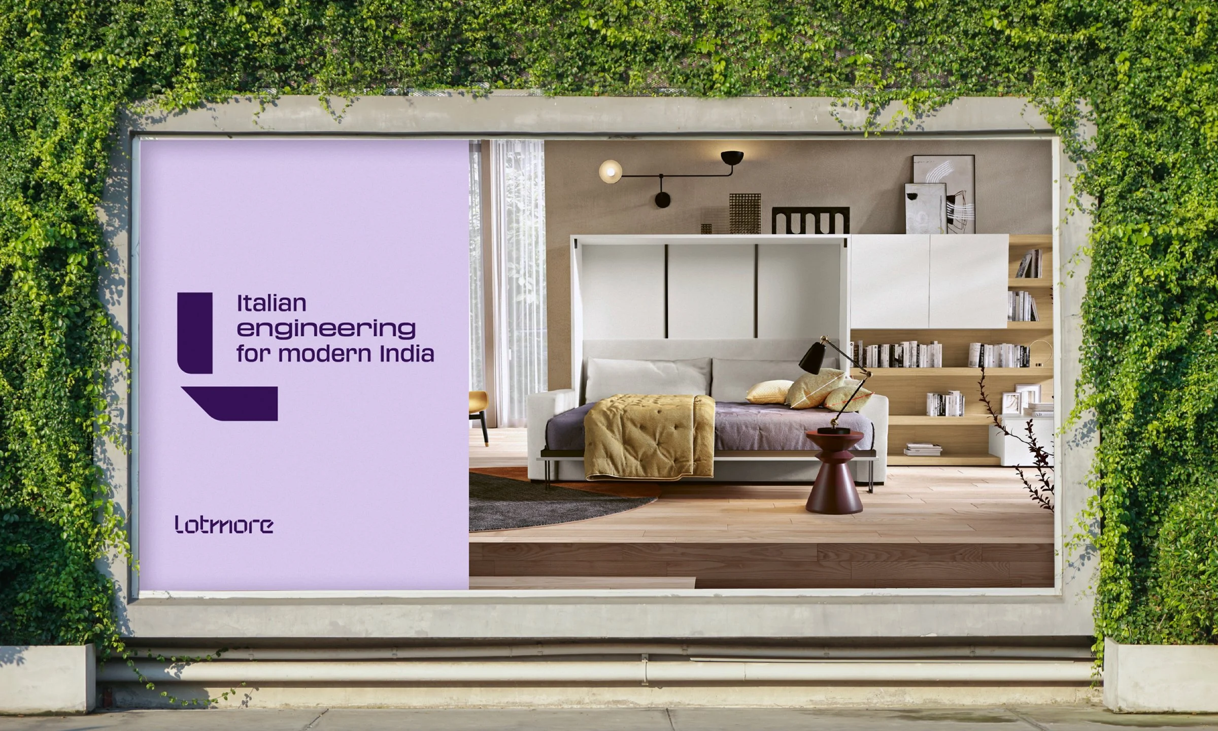
Lotmore’s confident, spirited personality gave us the foundation to craft a visual language that is playful yet distinctly ownable. The brand colours were chosen to reflect Lotmore’s commitment to innovative solutions and high-quality engineering, while also creating a visually striking and memorable identity.
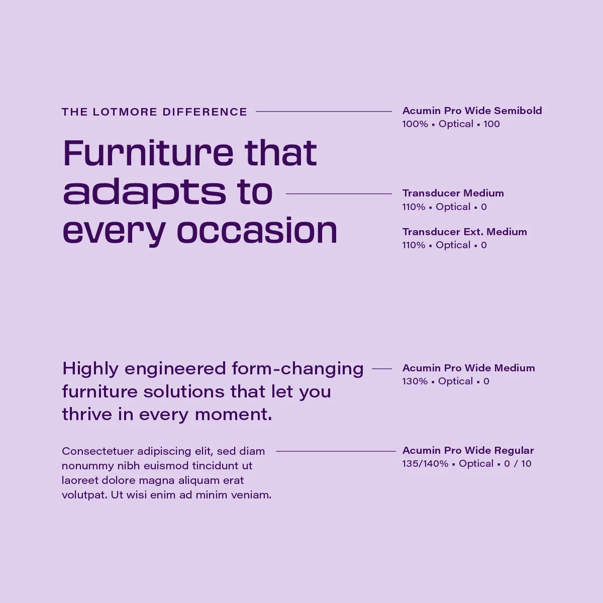
Typography is a foundational pillar in the visual language. Transducer was selected as the headline typeface for its mechanical construction and extended style, bringing dynamism to communication. To balance its boldness, we paired it with Acumin Wide, establishing a clear visual hierarchy and distinction.

Where play meets precision
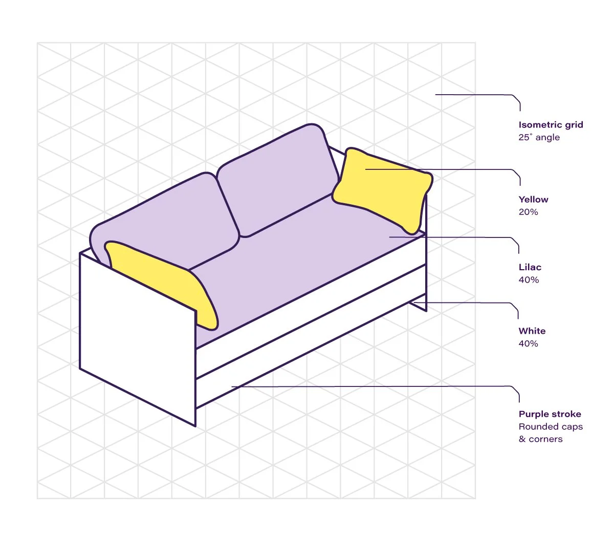
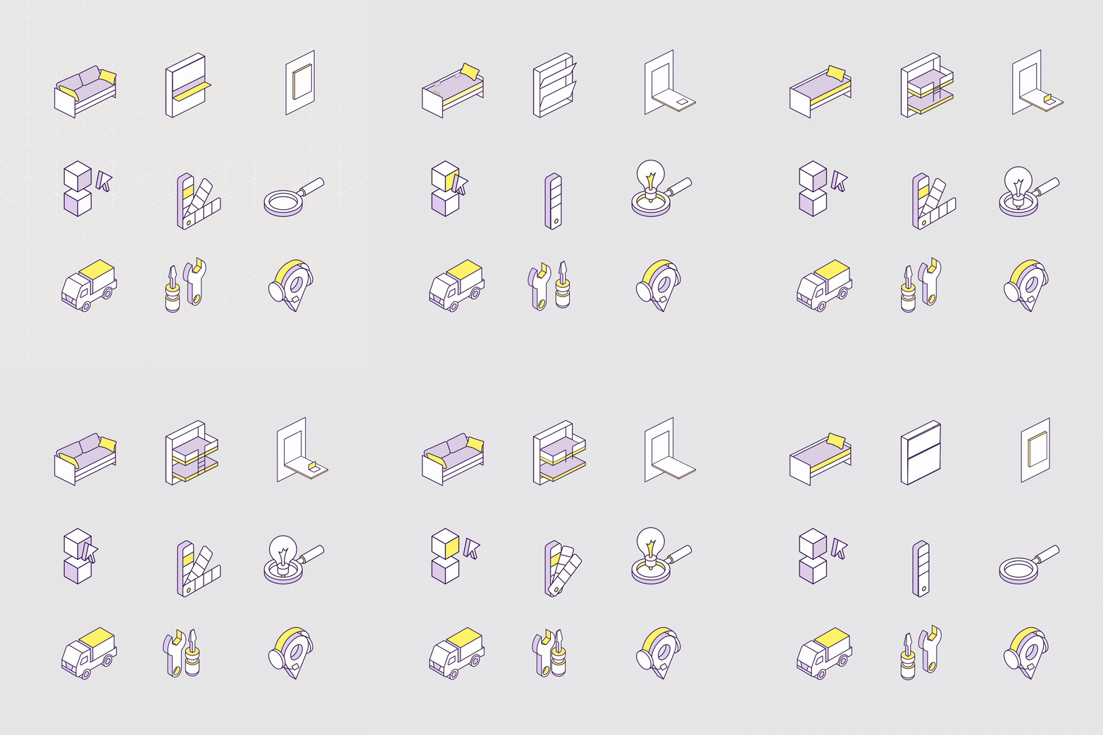
Illustrations were built on a 25° isometric grid to highlight the functionality of the offerings and add a sense of space and dimension. Folds and sharp corners became core brand elements, forming versatile design systems that could expand and adapt. These were thoughtfully integrated with negative space across applications to reinforce the brand’s central idea of creating space.

Crafting a digital experience
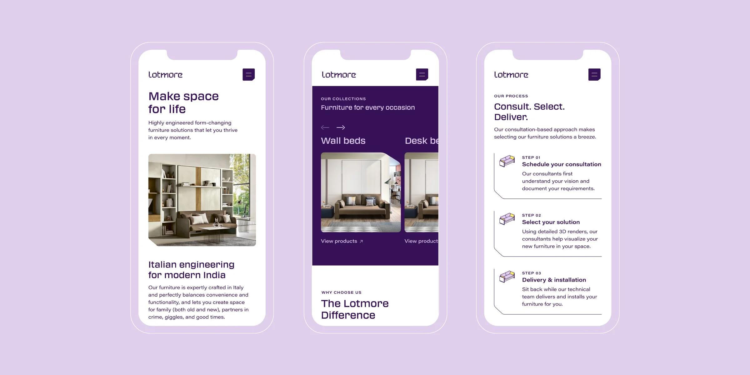
Our team saw months of strategy, positioning and designing come alive as we created the Lotmore Website.
A dynamic isometric illustration system, coupled with simple yet brand specific iconography, micro interactions that were a delight to animate, and visual treatments and graphics that expanded the identity seamlessly, were a few such details that we believe allowed us to pour life into this website design.
From blueprint to motion
We partnered with Renderframe Studio to create precise renders of the Lotmore product line. Beyond accuracy, our goal was to infuse warmth and highlight the superior functionality of the products – bringing them to life in a way that feels both exacting and inviting.