


Fresh to Home
Core Brand Assets
Brand Communication
Packaging Design
Website UI/UX
A celebration of freshness
An accidental meeting at a cafe led to being entrusted with the task of making customers aware that Fresh to Home delivered the freshest fish and meat to the consumer’s doorstep.
The brand strategy was, to create an image to match the product’s USP - freshness!


A fresh new identity
Working on creating a visual language for the brand that needed to cut across mediums and campaigns, the new logo emerged fresh and green. The water colour identity allowed the brand to have an authentic ‘fresh’ feel. The usage of water colour patches, strokes and bubbled typography that created a visual language which reflected the light-hearted feel of the brand.


Bangalore by the bay
As part of one of the earliest exercises we created a campaign in association with the Taj Vivanta. It was called - 'Bangalore by the Bay' - the freshest seafood festival in town.


The festival brought the finest selection of seafood, caught and cooked to perfection. Every week, the regional theme would change as we set sail to different coastal and culinary destinations. With themes changing every week, communication pieces were crafted to reflect the spirit of the region and the food.

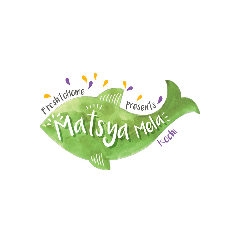
Festival of fish
Matsya Mela is a one of a kind fresh fish festival organised by Fresh to Home across locations. The idea was to create an identity that was self explanatory and ensured high recall. Here, we've extended the visual identity using water colour imagery and pastel colours.

Reimagining tradition
Fresh to Home ventured out into a new market with the freshest Idli dosa batter. We wanted to ensure that the packaging reflected the natural and traditional origins of the product. Hence, we created an identity based around the pestle and mortar, the age old method of grinding batter.
