Dhiway
Core Brand Assets
Brand Strategy
Brand Identity
Brand Architecture
Brand Communication
Visual Expansion
Website UI/UX
Redefining trust in a broken digital world
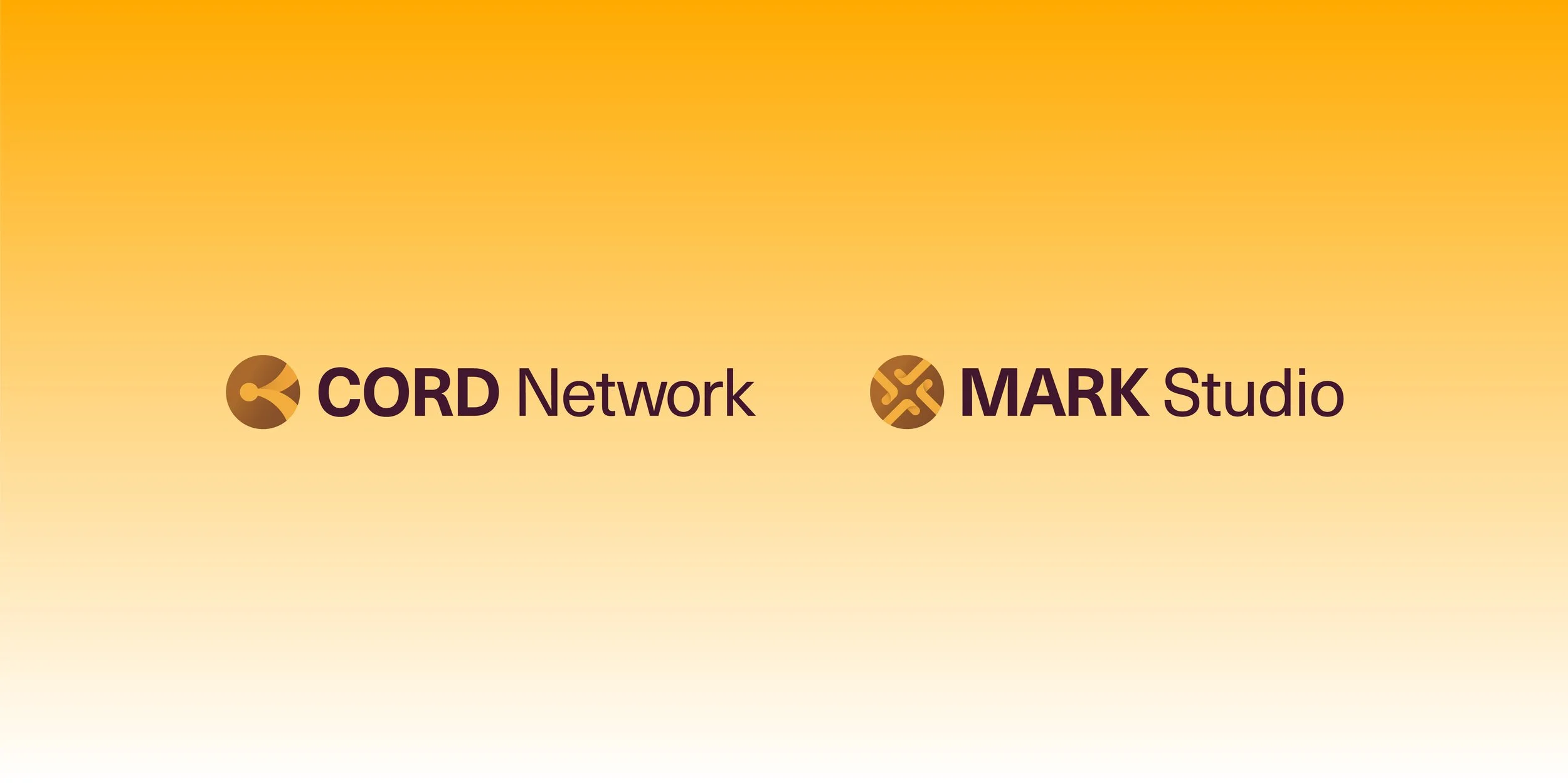
Dhiway, a blockchain company, was rapidly expanding its offerings. What began as a credentialing application (MarkStudio) had evolved into a broader ecosystem. It now featured CORD, the fastest and most scalable blockchain, along with a wallet and several complementary services.
As its offerings grew, the brand faced three core challenges: its messaging had become fragmented and inconsistent, its identity no longer reflected the scale of its ambition, and its products lacked a cohesive architecture to support future growth.
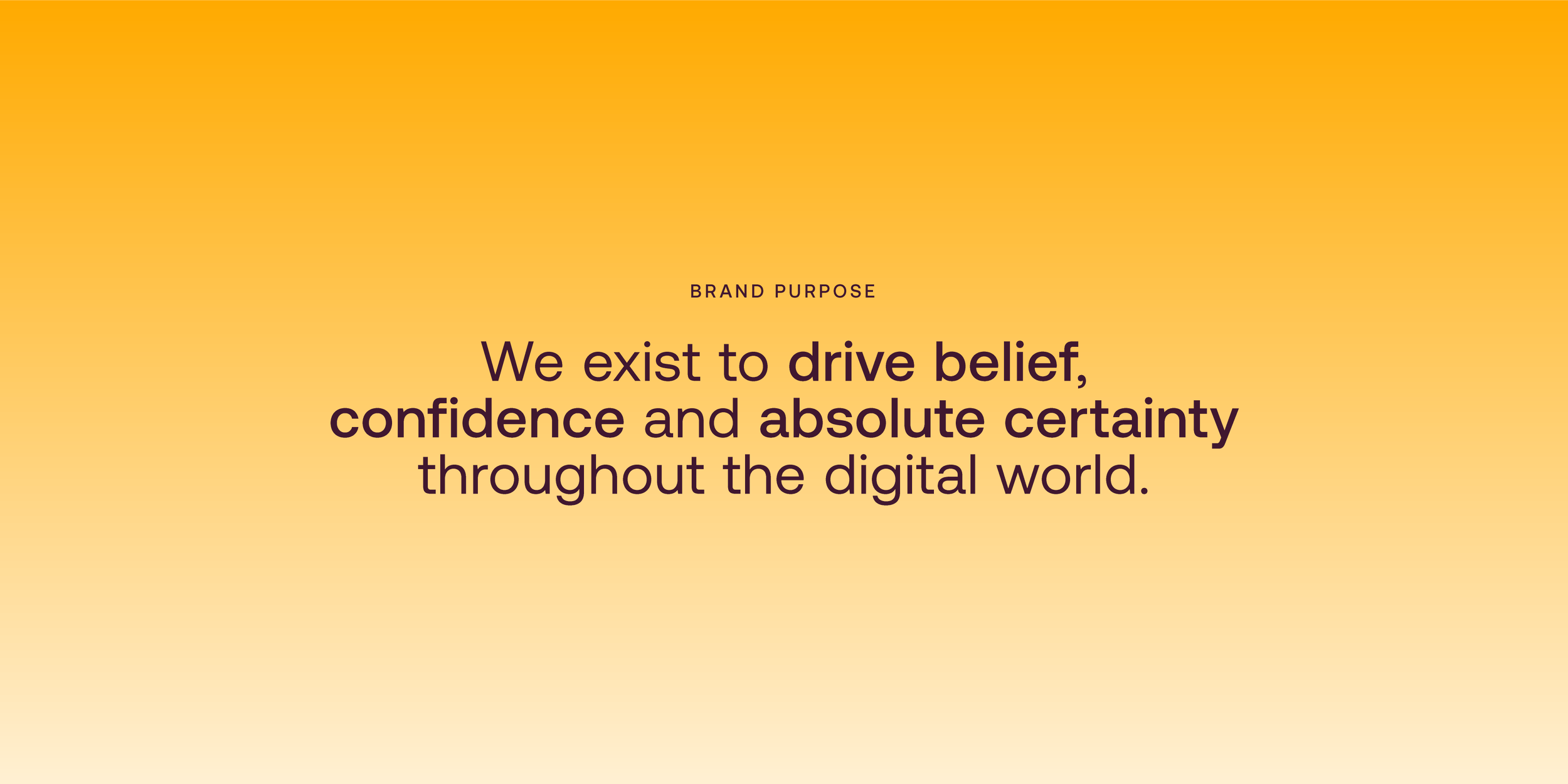
Crafting a purpose that drives belief
From our workshops, one insight stood out: the digital world is fundamentally limited by a lack of trust. Building on this, we defined Dhiway’s brand purpose and sharpened its strategy. Unlike most blockchain players, Dhiway combines low friction – delivering absolute certainty of data – with population-scale capability, powered by technology engineered for growth from the ground up.
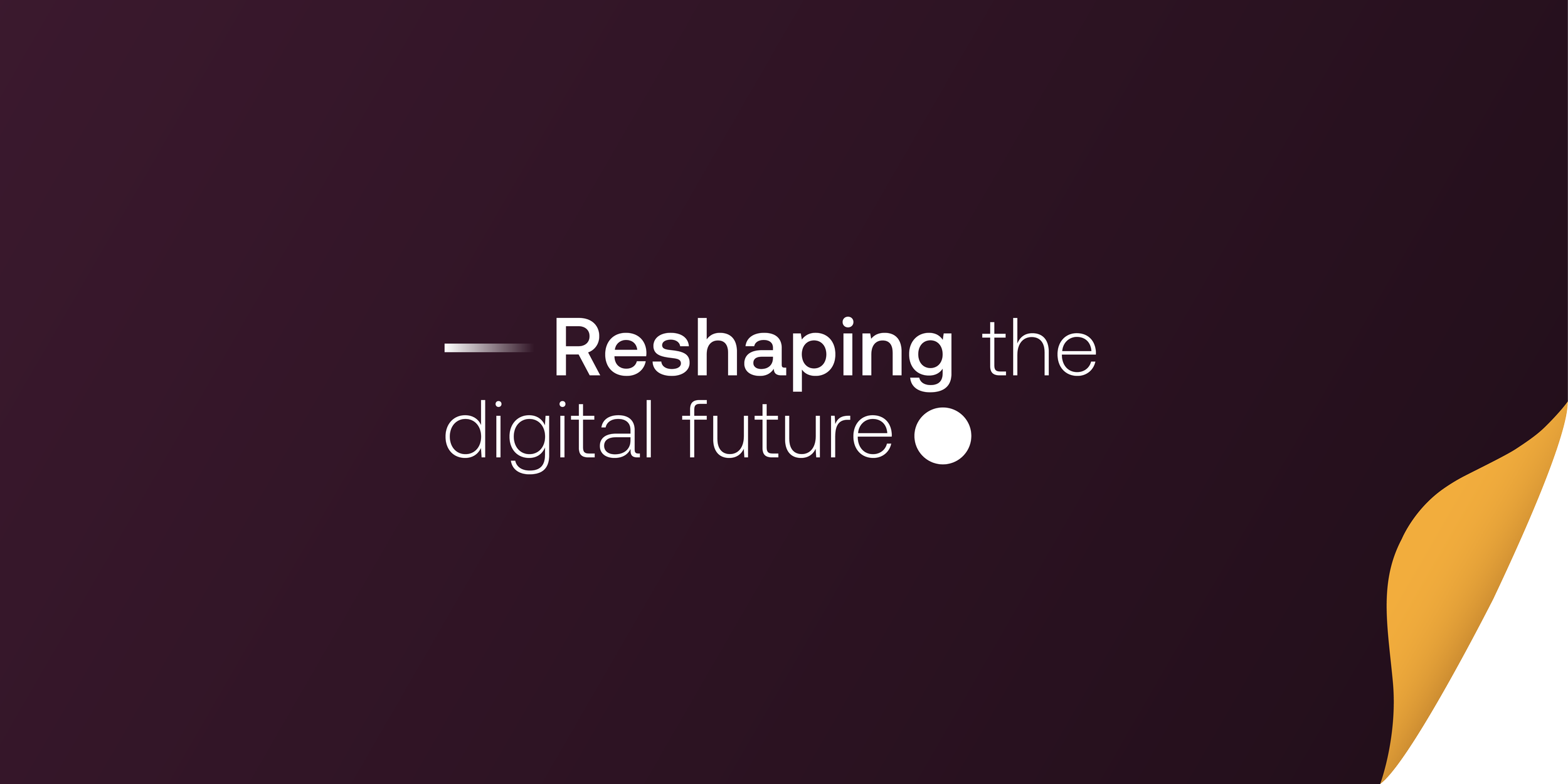
Articulating the brand promise
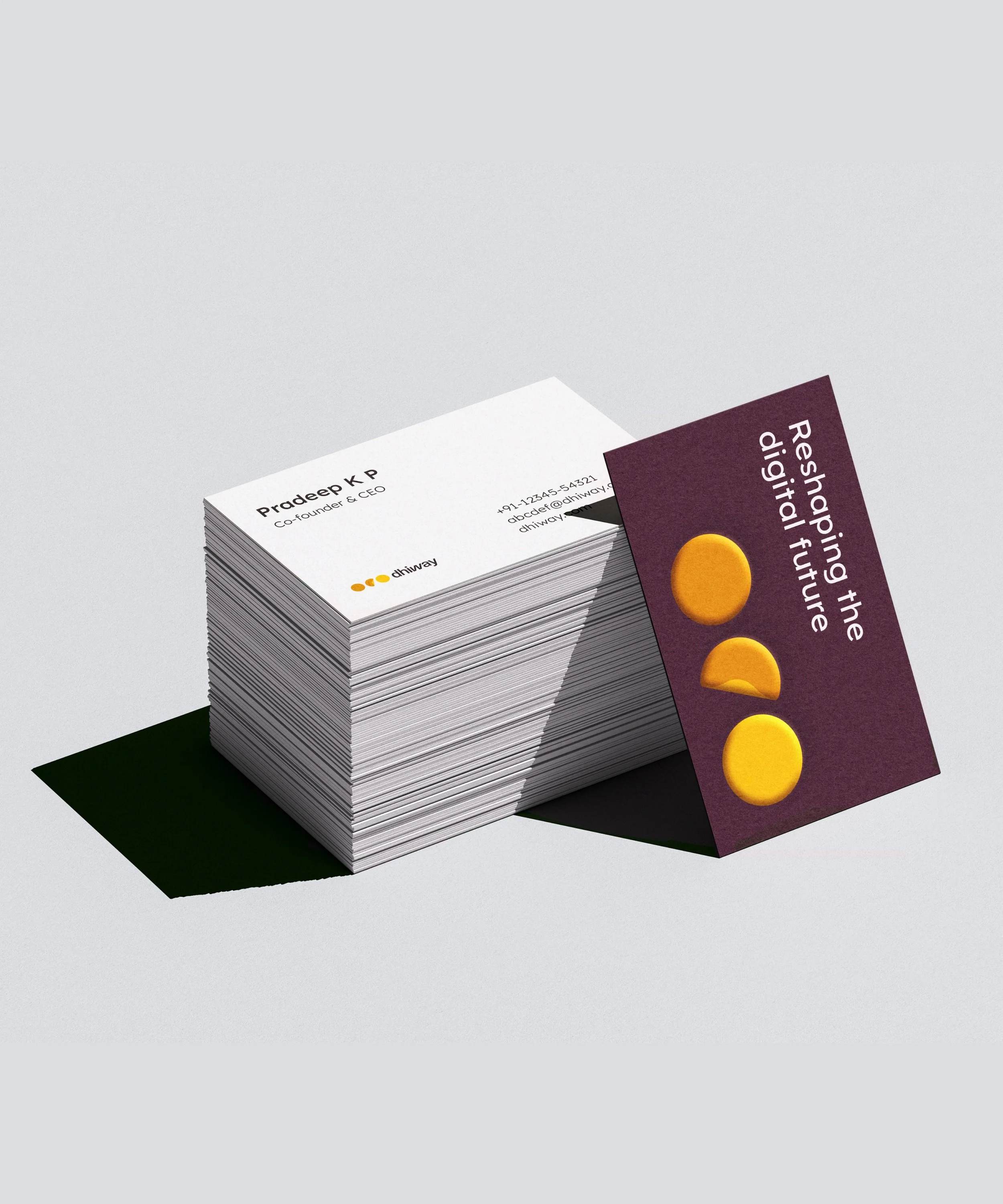
Once Dhiway’s Why was defined, we shaped its How. The brand promise was articulated as “Reshaping the digital future.” The word Reshaping was deliberately chosen to signal that today’s digital world must be rebuilt into one rooted in trust – and to reflect that this will always be an ongoing effort for Dhiway, captured in the use of the present continuous tense.
Turning the page on digital trust
The idea of “Reshaping the digital future” was brought to life through the concept of “Turning the page.”
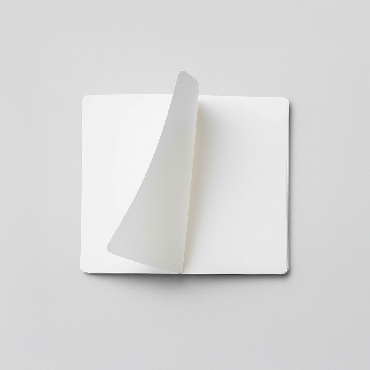

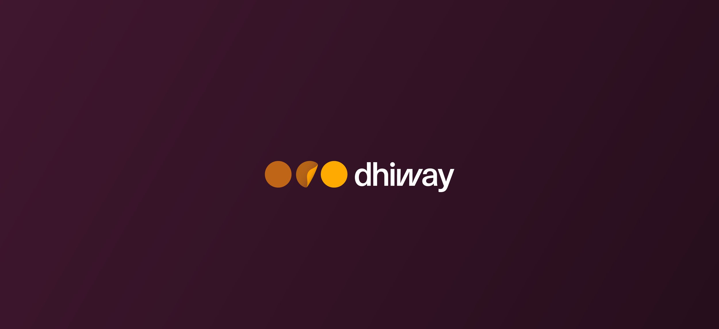
In a world strained by data breaches and digital clutter, it has become imperative to begin a fresh chapter where certainty and trust are built in. The Dhiway identity embodies this shift, with circles moving from dark to light to symbolise a transition towards a digital world filled with confidence and belief.
The brand architecture was designed to keep Dhiway’s focus on the parent brand, ensuring all offerings align under one identity for clarity and ease of management. As solutions scale, they can evolve into independent brands, while R&D projects continue to leverage Dhiway’s credibility. Each sub-brand draws from the parent system – embracing the central fold, colours, and typography – to establish a cohesive visual language that unifies the entire product family.
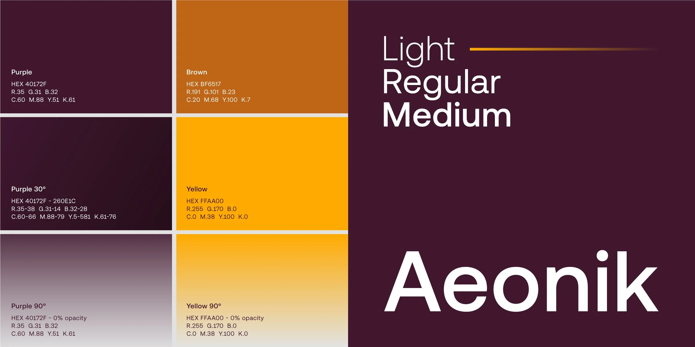
Colours & type that break category tropes
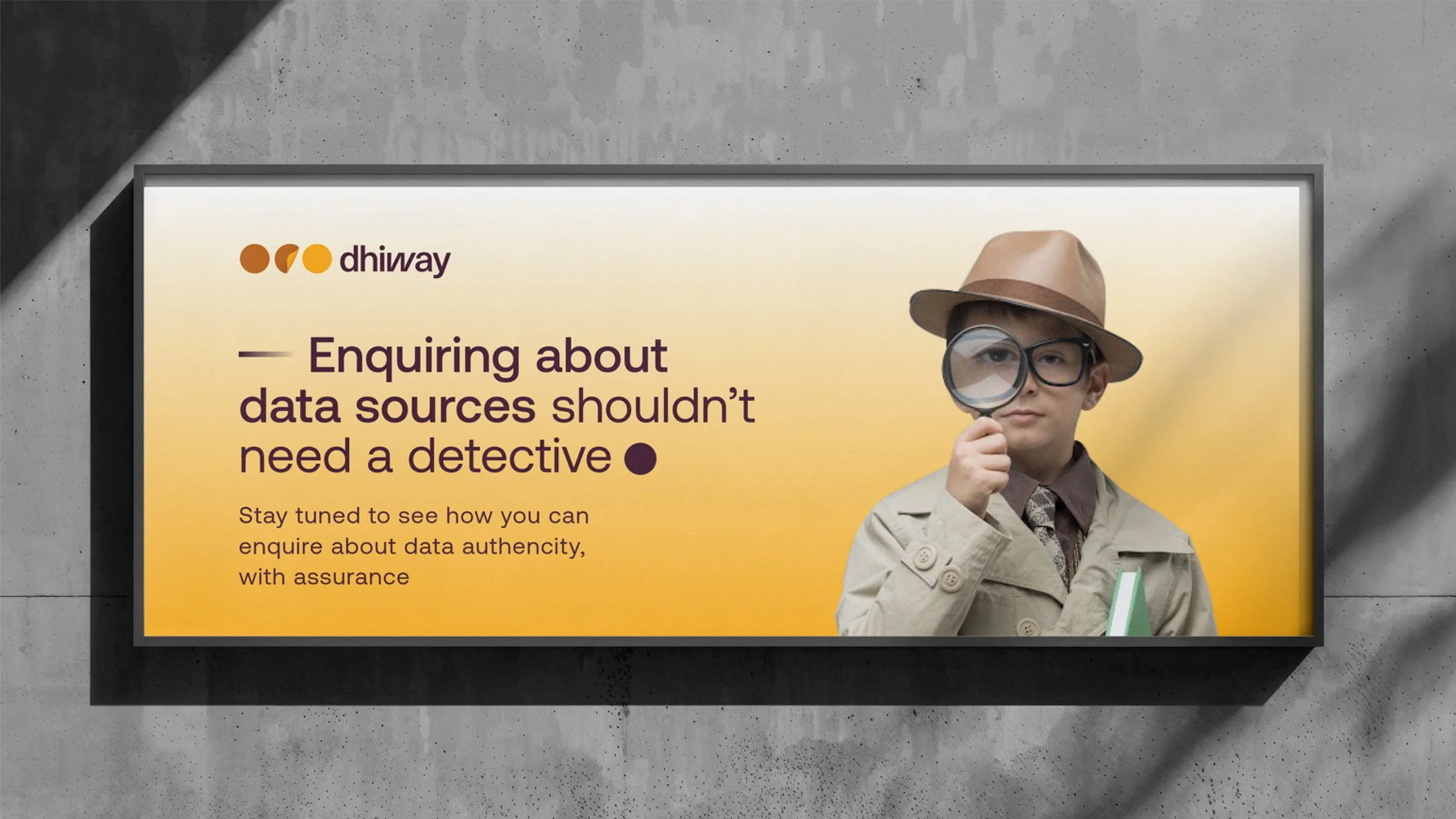
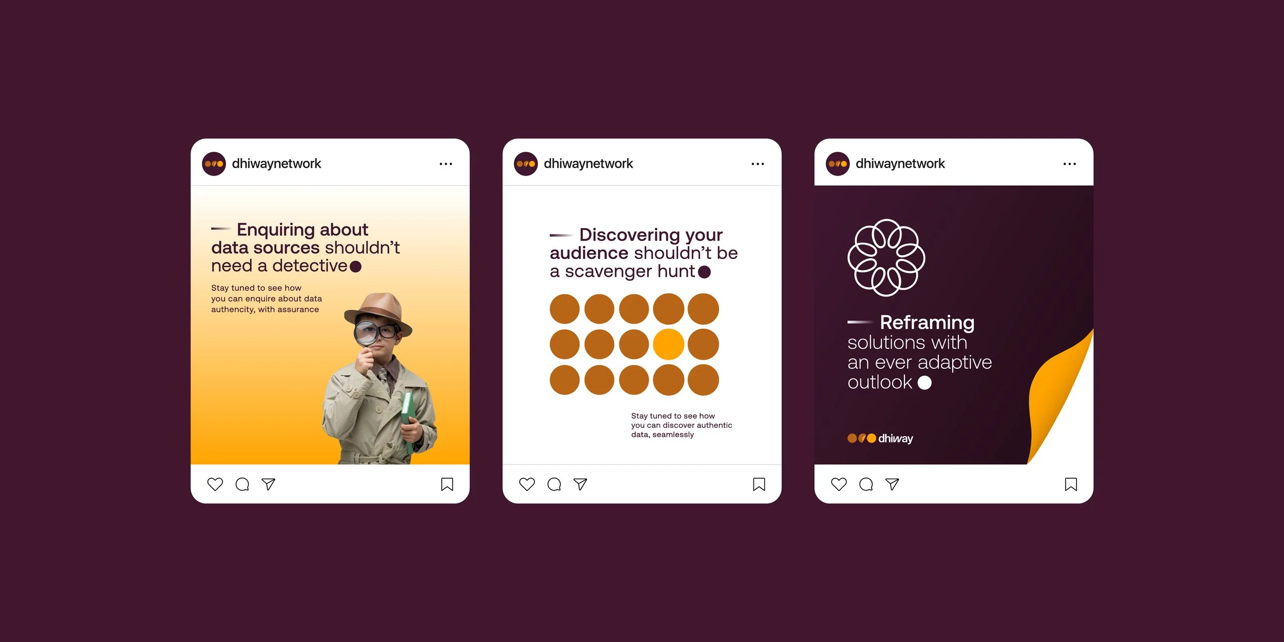
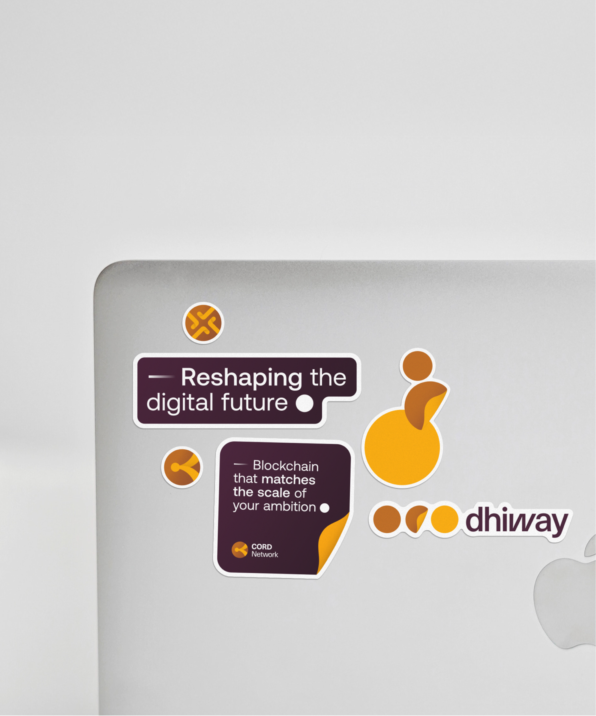
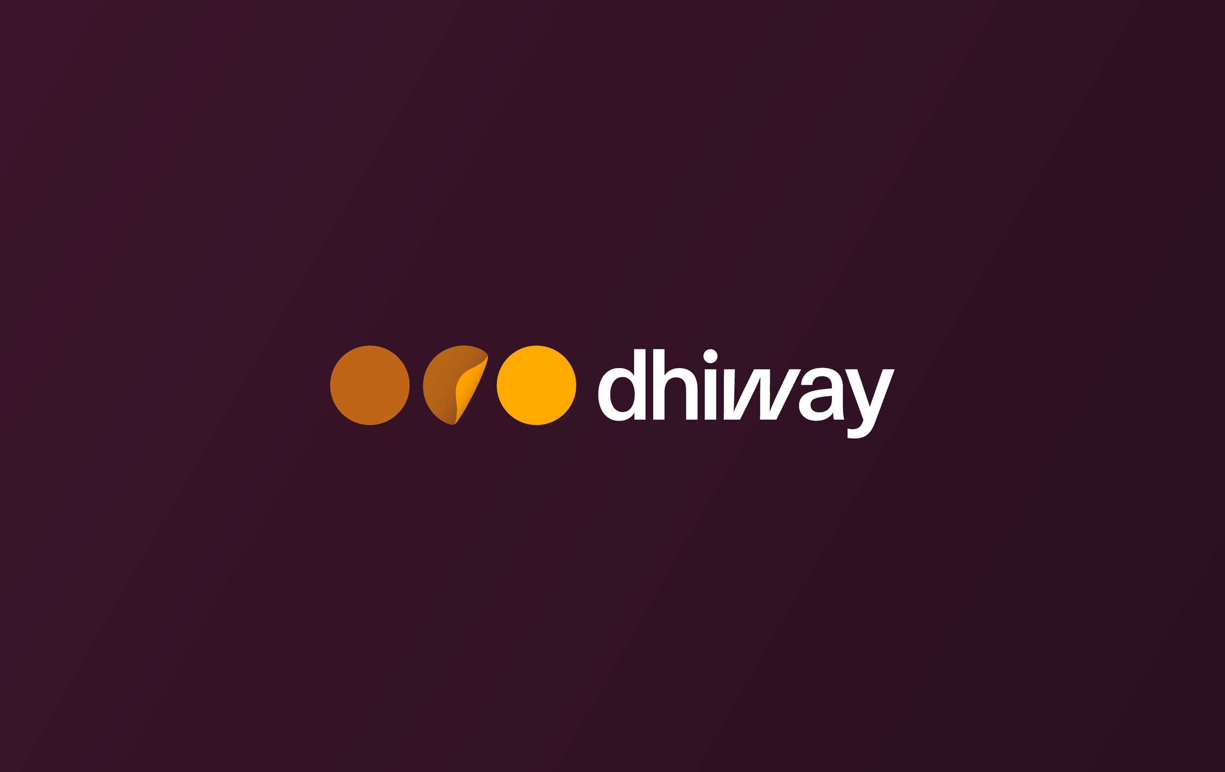
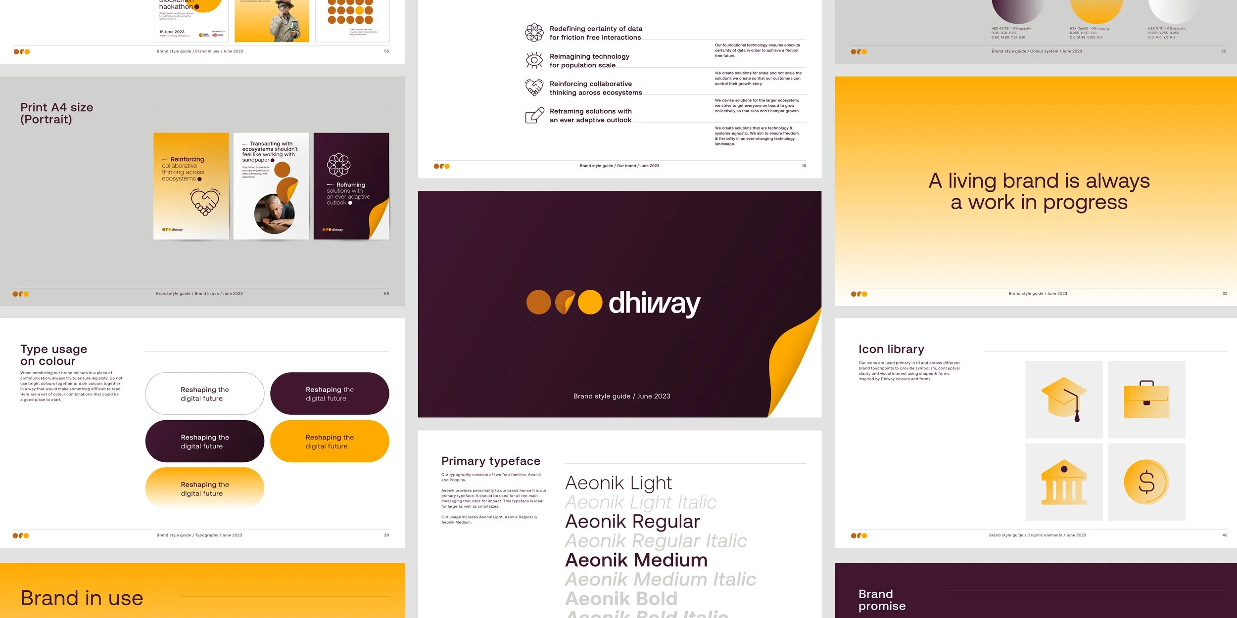
The blockchain ecosystem needed an accountable, confident voice to establish credibility, and Dhiway embraced that role by steering clear of the clichés that dominate cryptocurrency-driven brands. Bold, dependable, and self-assured, the identity breaks away from the typical blues and blacks of the category, instead adopting purple and yellow as its core palette, paired with the typeface Aeonik—a combination that reflects Dhiway’s balance of strength, clarity, and modernity.

Designing a language of trust
Dhiway’s visual language extends the brand’s confident, clear personality through a cohesive system of icons and layouts. The iconography, inspired by gradients and crafted on a pixel grid, is distinctive yet simple, with circle and square key-lines ensuring balance and legibility. The broader brand language draws from the folded circle mnemonic in the logo — evoking a rising sun and a new digital chapter — while elements like the Data Dash and Digital Dot narrate Dhiway’s story of trust and transformation in the digital world.
The broader brand language draws from the folded circle mnemonic in the logo — evoking a rising sun and a new digital chapter — while elements like the Data Dash and Digital Dot narrate Dhiway’s story of trust and transformation in the digital world.