

beckn
Core Brand Assets
Brand Strategy
Brand Guidelines
Brand Communication
Visual Extensions
Website UI/UX
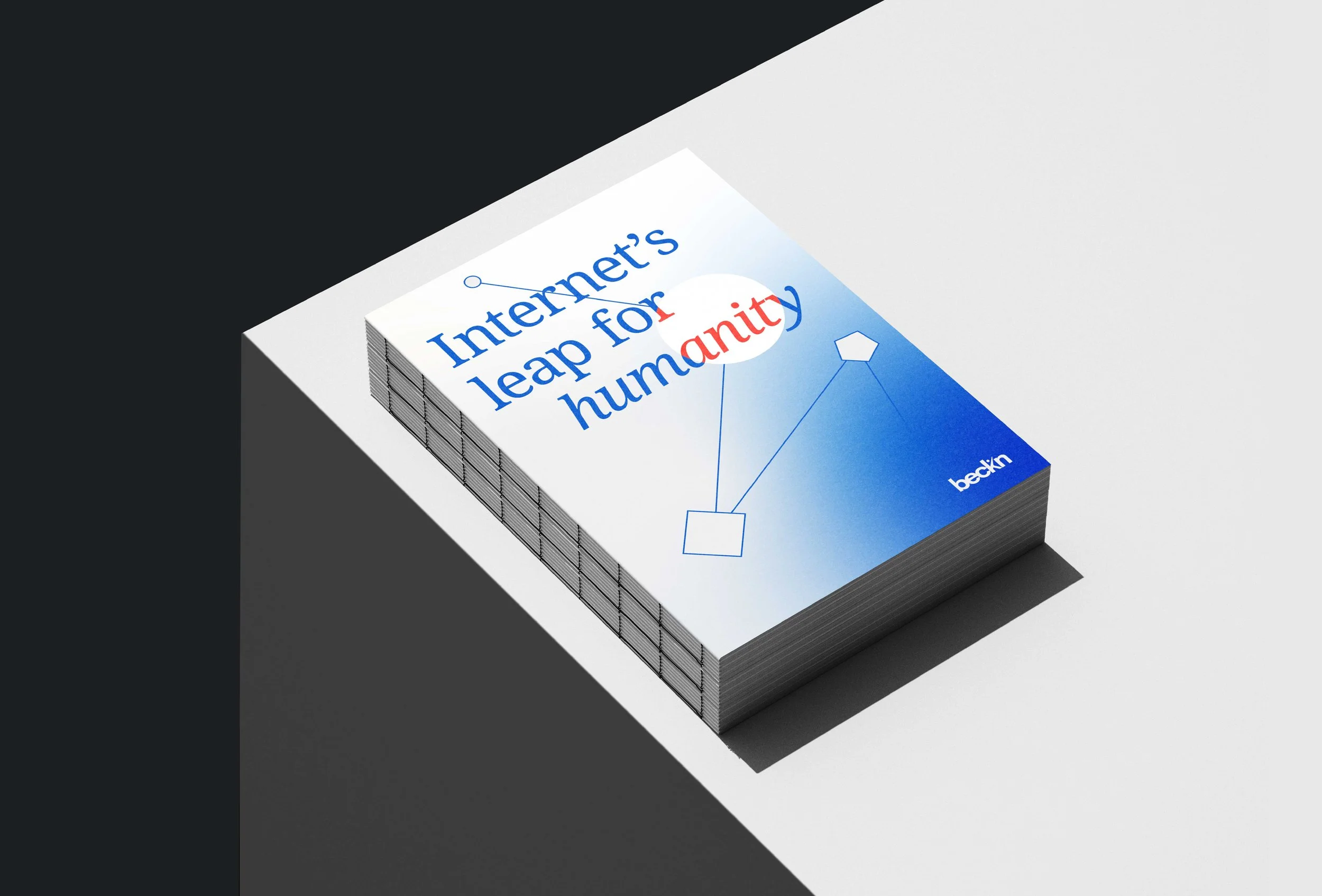
Internet's leap for humanity
The world carries interconnectedness in its pocket, yet still functions in silos. The internet was meant to be free, open, and accessible – but does that ideal still hold? beckn is a universal protocol that reimagines the internet by enabling open, decentralised digital ecosystems. After building beckn’s identity in 2020, we came back to evolve the brand language – moving from a quiet, minimal presence to one that felt bold, empowering, and counter-intuitive. Rooted in the metaphor of a rhizome, a non-linear network, the new identity reflects how the internet truly works. This came alive through the following elements –
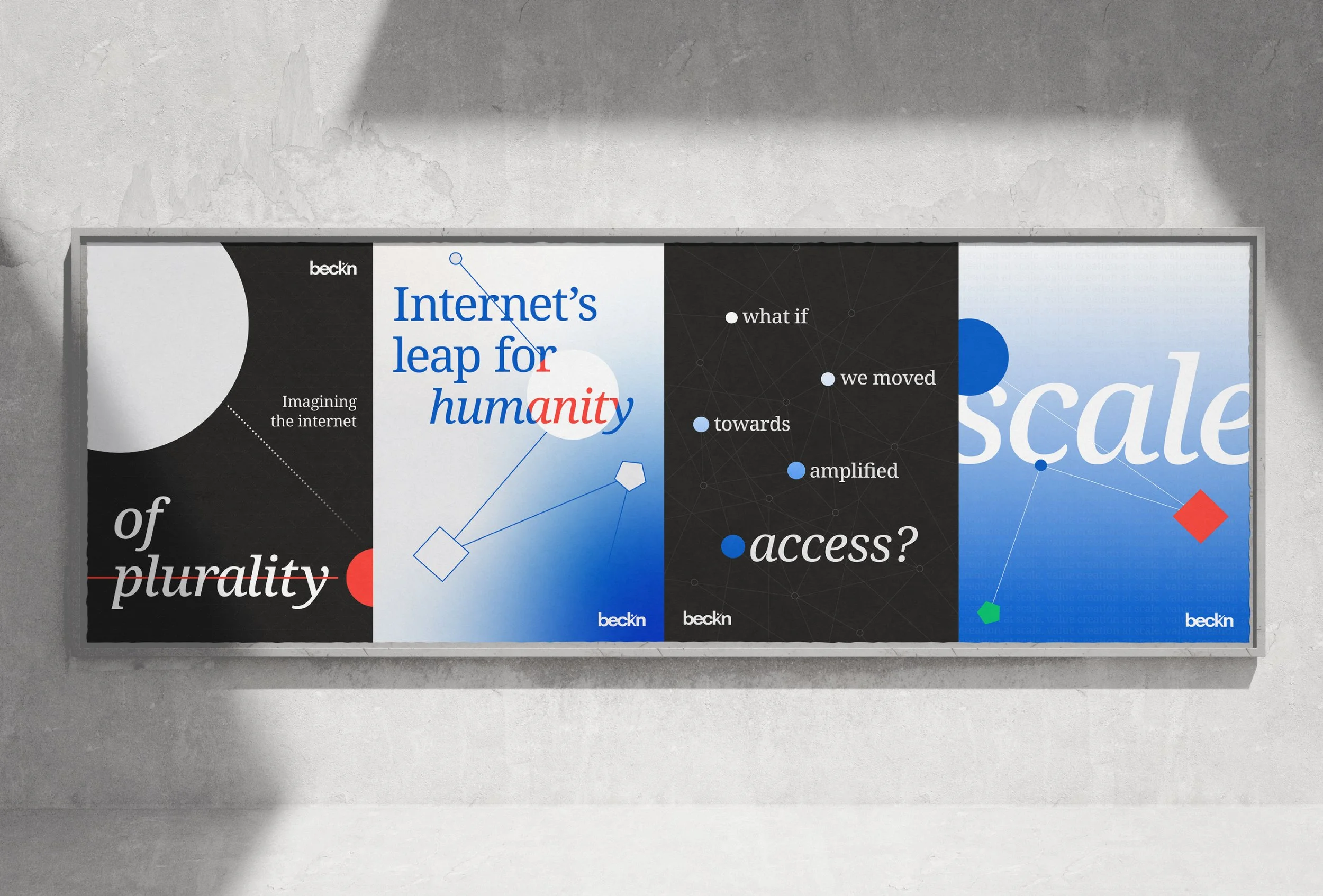
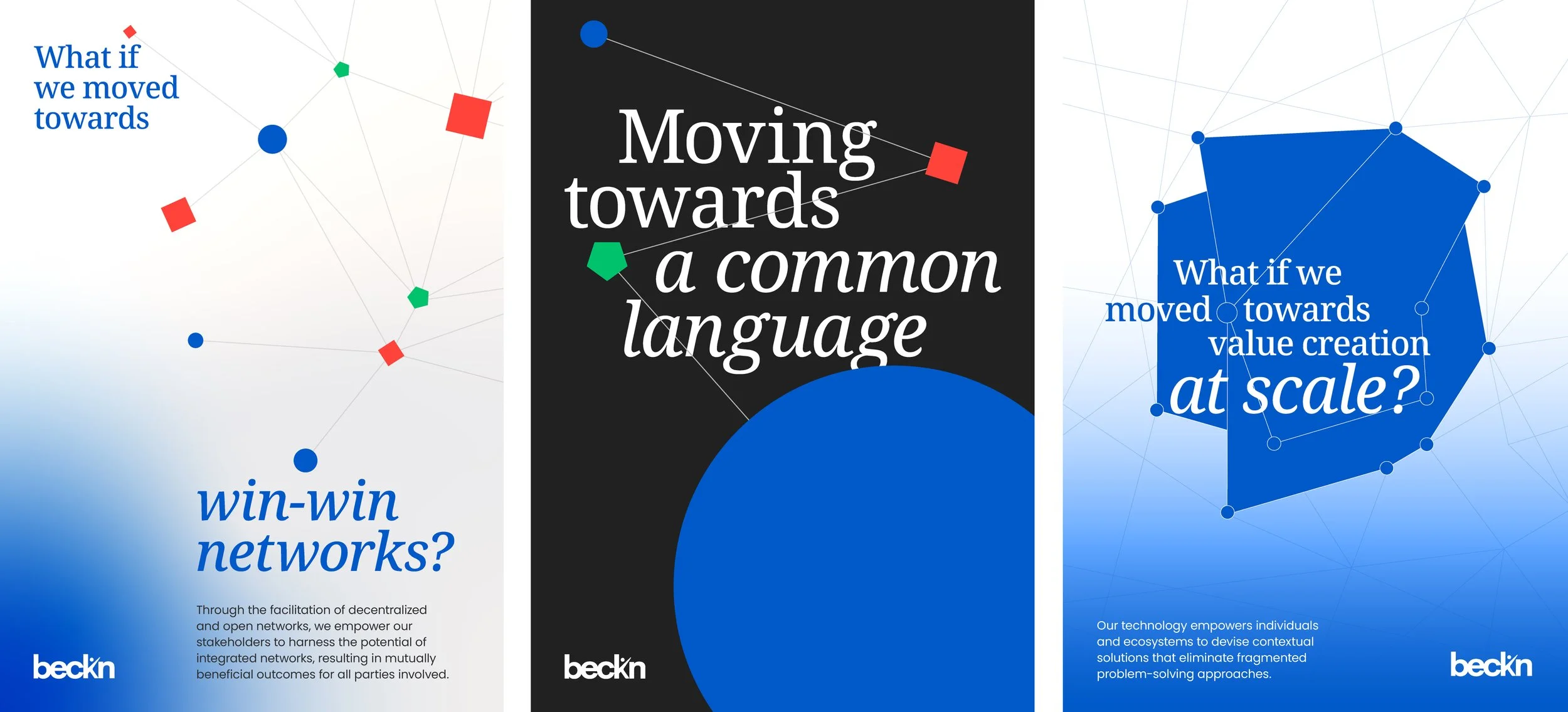


Expanding the visual identity
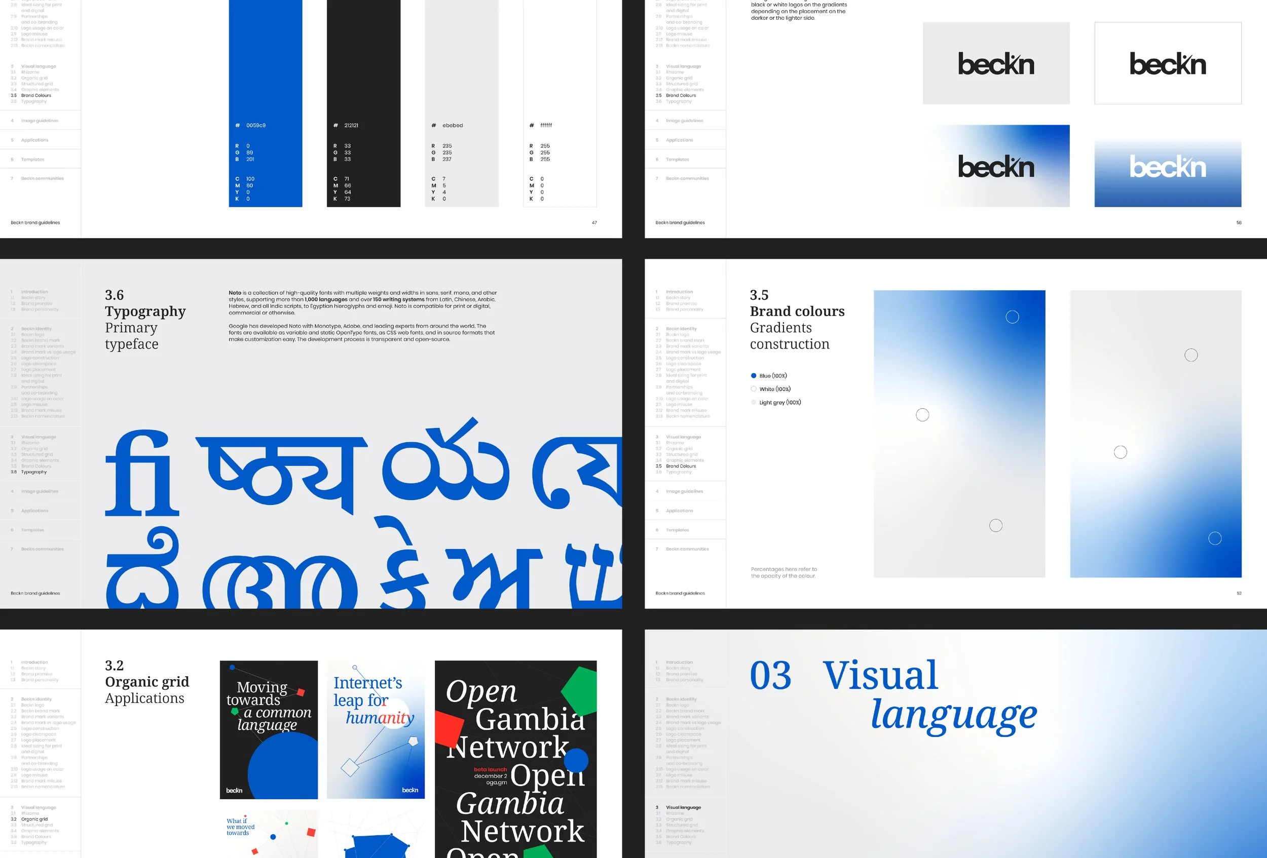
Grid
The underlying grid represents digital infrastructure and the connection between individuals, businesses & governments.

Gradation
The core value of minimal footprint is conveyed through the use of gradation in our visual language & logo.

Lowercase
Our brand stays passively visible and leaves a minimal footprint. This is reflected in the usage of lowercase text in our brand name and the gradation in our logo.

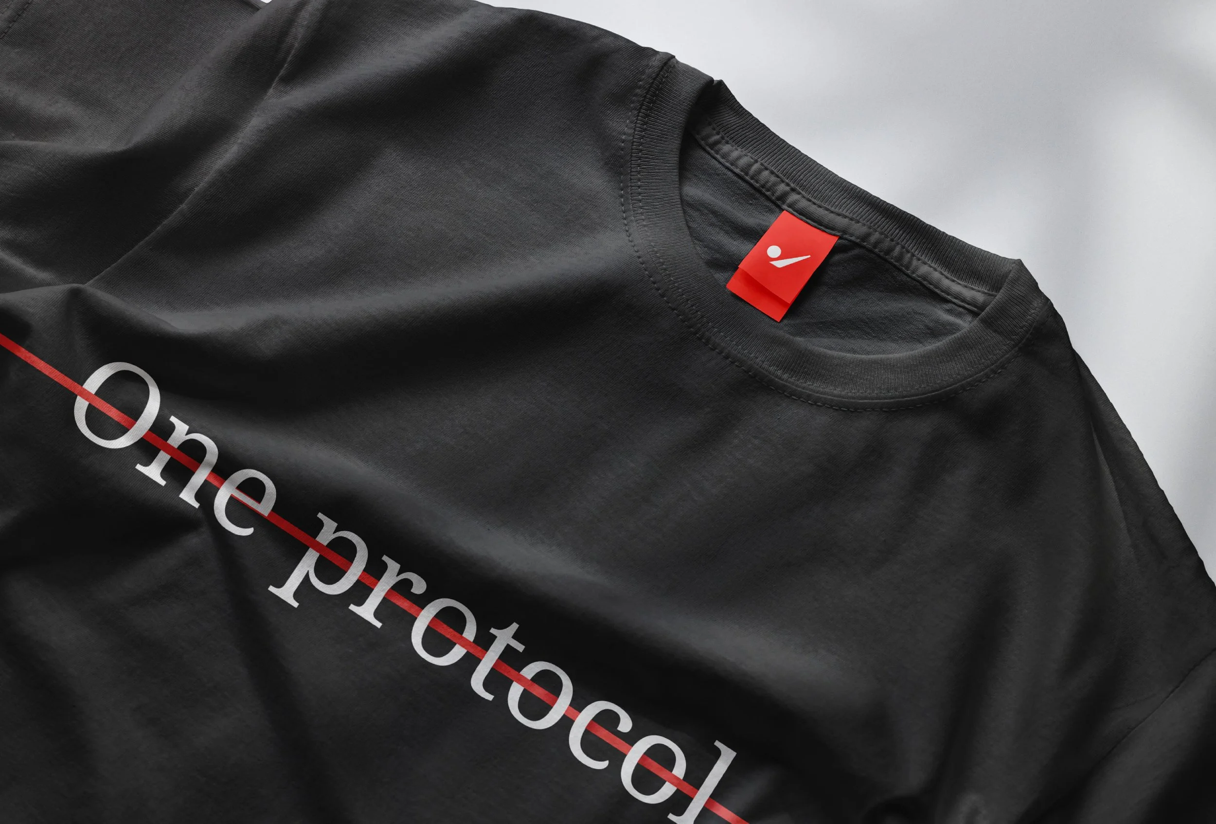
Verbification
Since beckn represents action and activity the word 'beckn' is used as a verb.