

beckn
Core Brand Assets
Brand Strategy
Brand Guidelines
Brand Communication
Visual Extensions
Website UI/UX
Getting the internet back to its roots
The world today walks around with interconnectedness in its pockets. We have access to unlimited resources, yet we function in silos. The initial simplicity of the internet and the email got lost to a world of closed ecosystems. beckn believed a simple solution to this complex problem was to get these silos connected to each other.
beckn is an e-commerce protocol that eases the lives of its 3 main audiences - businesses, governments and individuals, by connecting them to each other. The team reached out to us to create an overall branding strategy to bring this powerful idea to life. They reached out to us to help build this brand story. We worked with them to create the overall brand strategy, positioning and visual language.


Carving out the positioning
An abstract idea like this needed intense collaboration. We worked as a tight knight team during the discovery phase and led quite a few workshops & discussions with their team. This allowed us to pen down strong values for the brand and a clear positioning.

Consumers
beckn eases the consumer’s life by making all forms of resources accessible and providing them with the freedom to choose.

Market Players
beckn eases the lives of businesses by increasing their reach to new markets and customers

Governments
beckn eases the government's journey by improving the lives of citizens through integrated infrastructure.


Hailing a brand identity
During our collaborative sessions, two things stood out; we wanted the identity to convey the concept of ‘beckoning’ or ‘hailing’ and for it to be universal. In its purest form, beckn would provide the ability to ‘access anything, at any time’ or in simple terms give us the ability to ‘beckn’ anything. It also enables interoperability across operating systems and apps, making it universal.
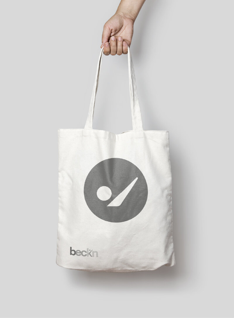
We combined these 2 concepts through the use of another universal language that made integration across platforms and technologies possible – ASCII codes. The ASCII characters of ‘.’ and ‘/’ when put together give the visual of a person with a hand raised; signaling something over. The logo was created by extending this basic thought and transforming the letter ‘k’ in beckn. The clean approach to the identity and the tapering gradation illustrates beckn’s idea of leaving a minimal footprint.

Building a visual system
The colour system was created to reflect the idea of a core infrastructure. RGB forms the base of the entire colour system. Using these three colours, one can beckn any colour. In other words, they are the digital infrastructure for beckn’s colour system.
Arial is a realist sans-serif typeface. It is one of the most basic fonts used across technology ecosystems. Using Arial lends our communication pieces an air of inclusiveness and universality, keeping in line with the core values of beckn.
The iconography and illustration were constructed by combining elements derived from the brand mark with base shapes. The icons were designed to be universal without having references to any ethnicity, race or cultural backgrounds. They were used across different
touchpoints to create symbolism, conceptual clarity and visual interest.


Expanding the visual identity
Grid
The underlying grid represents digital infrastructure and the connection between individuals, businesses & governments.

Gradation
The core value of minimal footprint is conveyed through the use of gradation in our visual language & logo.

Lowercase
Our brand stays passively visible and leaves a minimal footprint. This is reflected in the usage of lowercase text in our brand name and the gradation in our logo.

Verbification
Since beckn represents action and activity the word 'beckn' is used as a verb.

Expanding the visual identity
Grid
The underlying grid represents digital infrastructure and the connection between individuals, businesses & governments.
Gradation
The core value of minimal footprint is conveyed through the use of gradation in our visual language & logo.
Lowercase
Our brand stays passively visible and leaves a minimal footprint. This is reflected in the usage of lowercase text in our brand name and the gradation in our logo.
Verbification
Since beckn represents action and activity the word 'beckn' is used as a verb.